HAVAIANAS
Rebranding
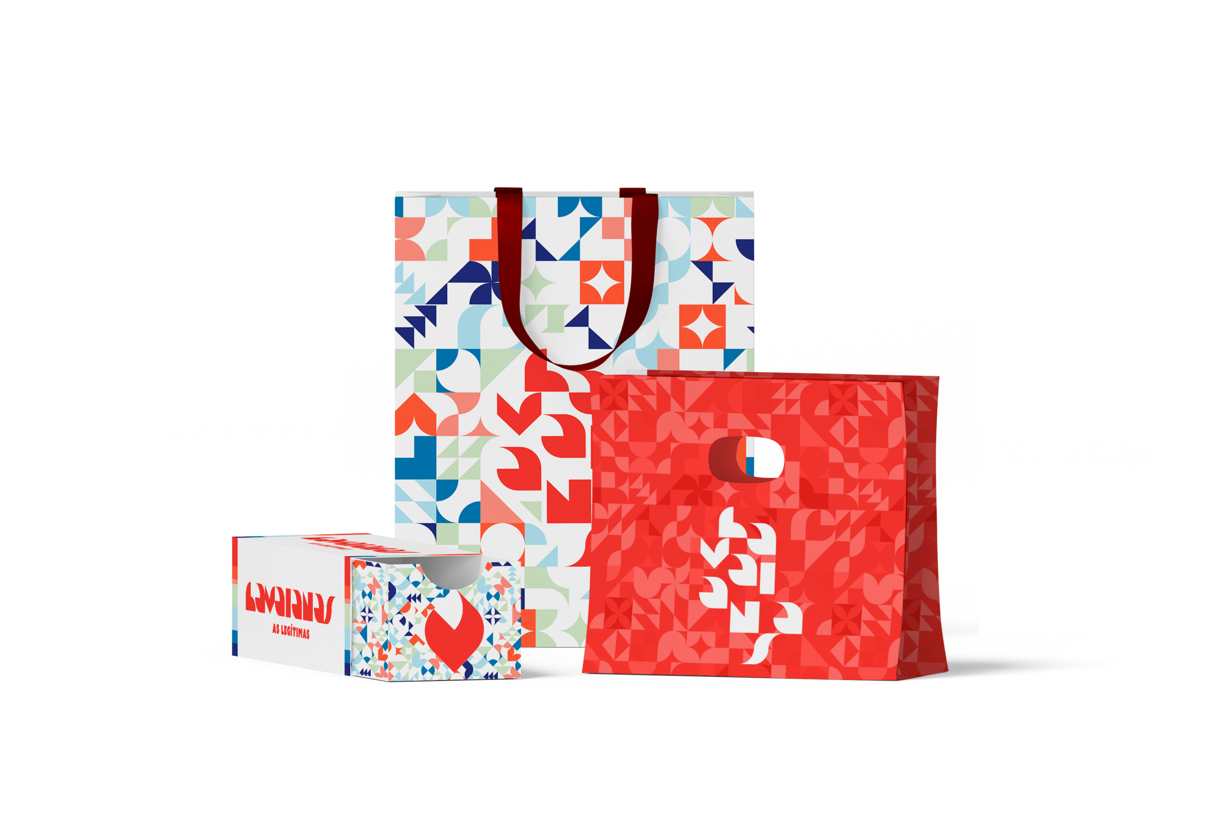
The project started as a challenge by colleagues to rebrand the traditional Brazilian brand - Havaianas. I decided to use this as an opportunity to be as creative as I could.
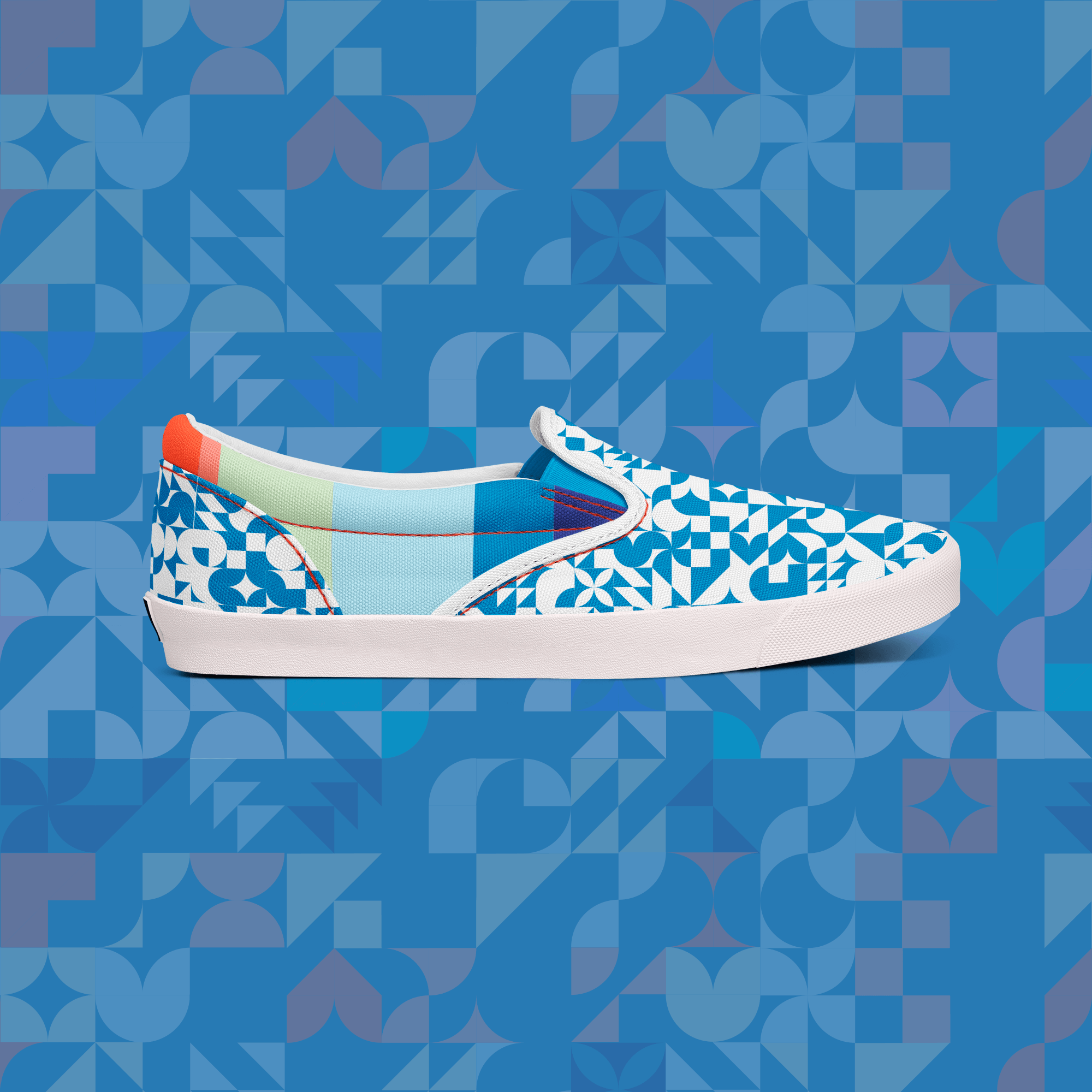
The concept was inspired by typical Brazilian mosaics. The style combined with a unique color palette created a new versatile identity. The brand would be recognizable not only by the logo but with its patterns and brand elements.

The logo was constructed with a simple square grid; each letter was created with a combination of a maximum of 4 pieces of the core elements.
After these same elements were used to create several patterns that can after be applied through out the brand identity.

Brazilian
⋆
Tropical
⋆
Modern
⋆
Laid-back
⋆
Memorable
⋆
Brazilian ⋆ Tropical ⋆ Modern ⋆ Laid-back ⋆ Memorable ⋆